
Product Designer · Sendible · 2026 · 14 min read
The report that couldn't explain itself
What six months rebuilding a reporting system taught me about designing for the moment a product has nothing to say.
Try the live prototype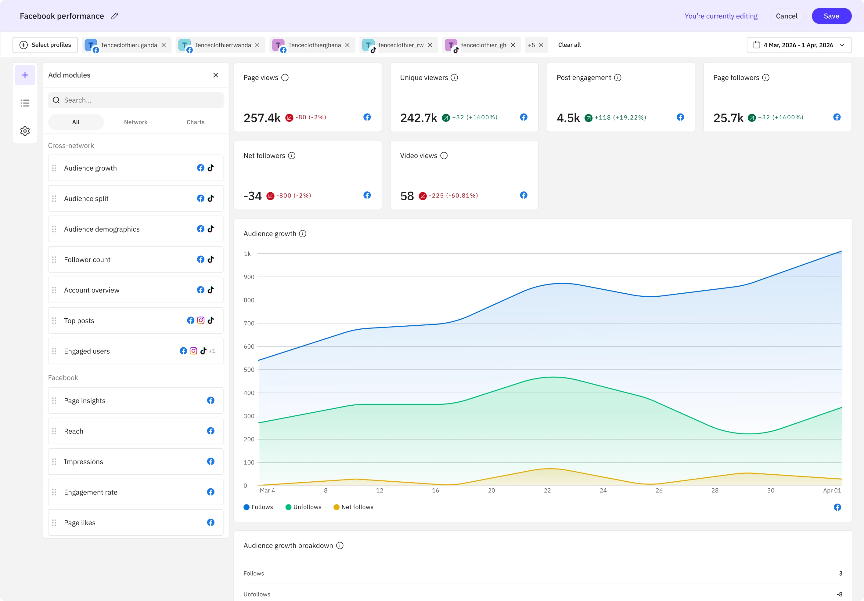
- 2 → 1
- systems merged
- 5
- ways it cost revenue
- 4 years
- of the same complaint
What I did
- Ran discovery across customer success, onboarding and support, then read customer tickets directly rather than summaries of them
- Collapsed two disconnected reporting systems into one experience where every report is editable, regardless of how it started
- Redefined the interface and interaction model, including a six-state model for the moment a report has nothing to show
- Designed the surfaces it runs on: the report canvas, edit mode, templates panel and reports list, each resolved over several iterations
- Built a working prototype in code that let the team test real behaviour and gave the whole company something to look at
- Mapped the five ways weak reporting was costing revenue, and scoped the first release to two networks so it would look finished, not unfinished
Short on time? Take the two-minute walkthrough →
The problem
Reporting was quietly pulling customers out of the product, and it had been doing it for years.
In 2022 a customer wrote to her account manager about it.
“I would prefer to stay with Sendible, the price point is perfect and the interface is much easier to manage. But I have not felt much confidence in the reports we’ve been trying to generate lately. Are there plans to change or update how reporting is done?”
Four years later I was asked to answer that question.
By the time I picked it up, the same note was arriving from three directions.
A customer who scored us zero on NPS wrote that reporting wasn’t what she needed to manage anything at scale. Not flexible enough, and the date ranges too short to see one year against another.
A trialist with fifteen years in social marketing signed up on a lower plan than we’d expected, because she’d seen numbers in reporting she didn’t believe.
And a customer who bought a larger package specifically to get custom reporting called it clunky and slow, then went to Meta’s own dashboard instead. She’s since been asked to research replacement platforms for 2027.
Nobody was describing a missing feature. They were describing a product they’d stopped believing.
Reporting had become a reason to leave, a reason not to upgrade, and a reason to pick a smaller plan. I’ll come back to what it was costing.
Why belief had gone
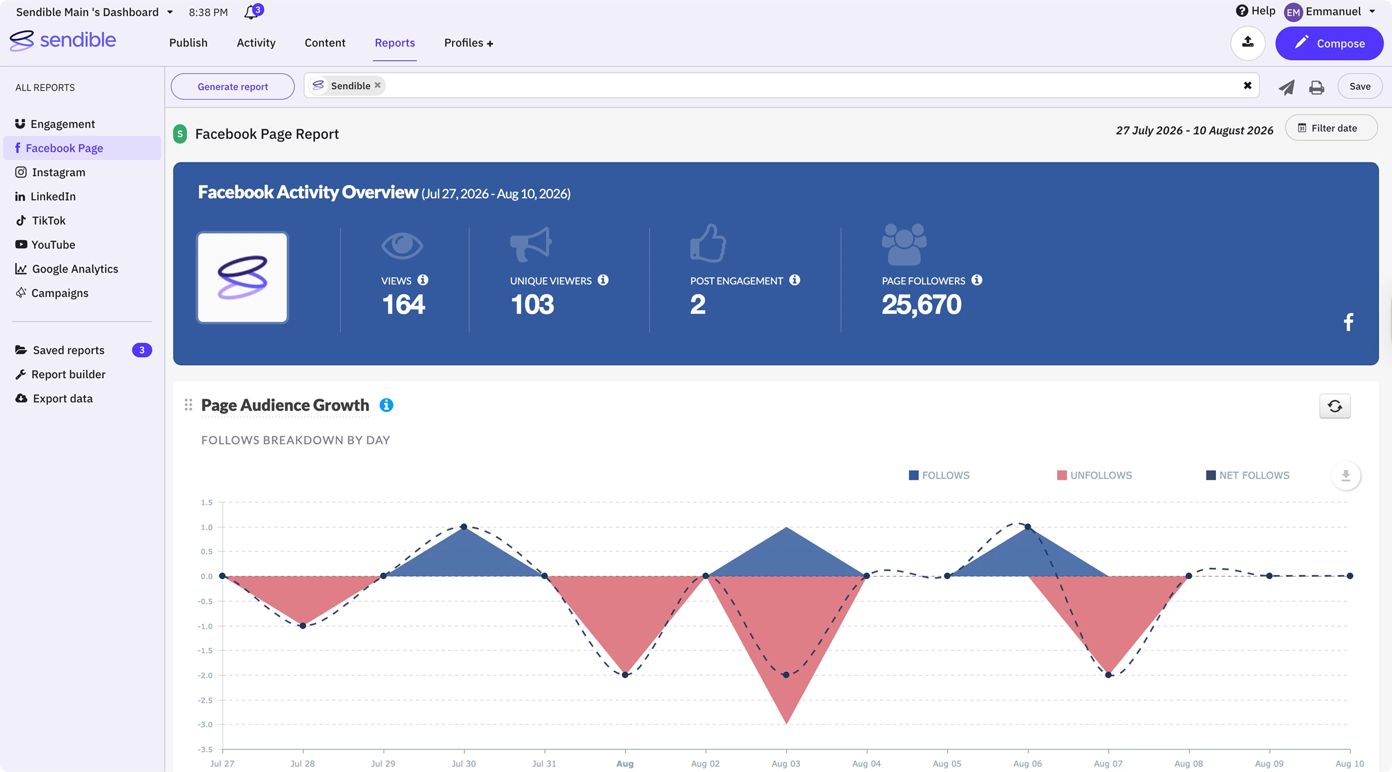
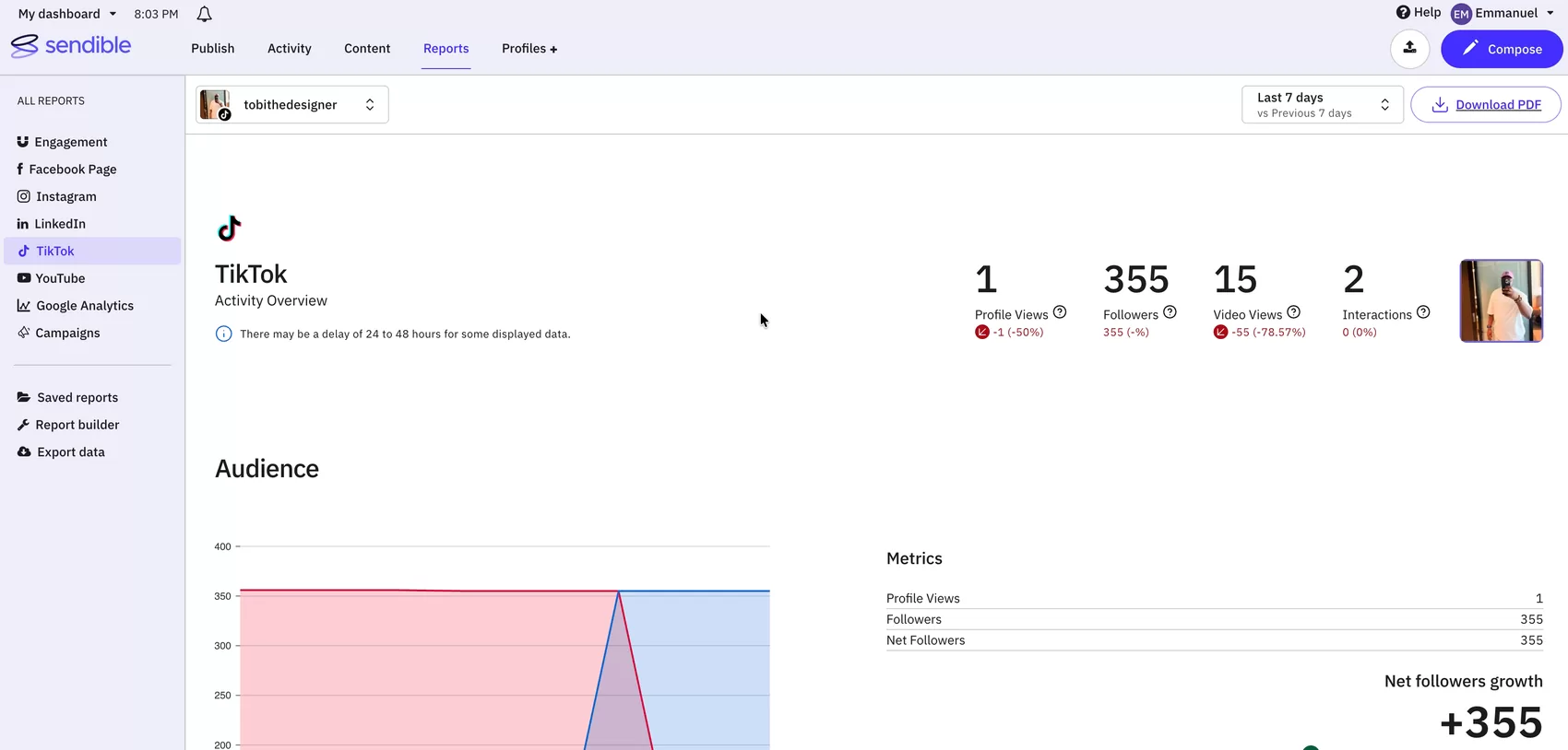
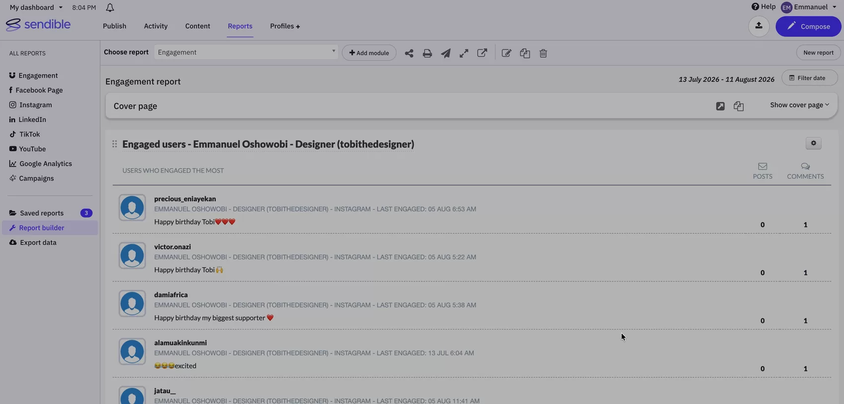
Reporting had grown into two systems that didn’t know about each other, and the navigation said so.
1 On the left rail: every network is a separate report, and report builder is a separate product.
Engagement, Facebook, Instagram, LinkedIn, TikTok, YouTube, Google Analytics: seven destinations, seven fixed reports, with custom reporting further down the same list behind a higher plan. A customer wanting Facebook and Instagram in one report had to leave and start again somewhere else.
2 On the drag handle: you can reorder the modules you were given, but you can't change or delete them.
The drag handle moves modules. Nothing adds one, removes one, or changes how a metric is drawn.
3 On the colour: five palettes on one screen, and none of them belong to the report.
Sendible purple in the chrome, Facebook blue in the module header, a green status marker, blue and salmon in the chart. Each network's report borrowed that network's colour, so no two reports in a set ever looked related. For agencies sending these to their own clients under their own brand, a report that can't look like one document certainly can't look like theirs.
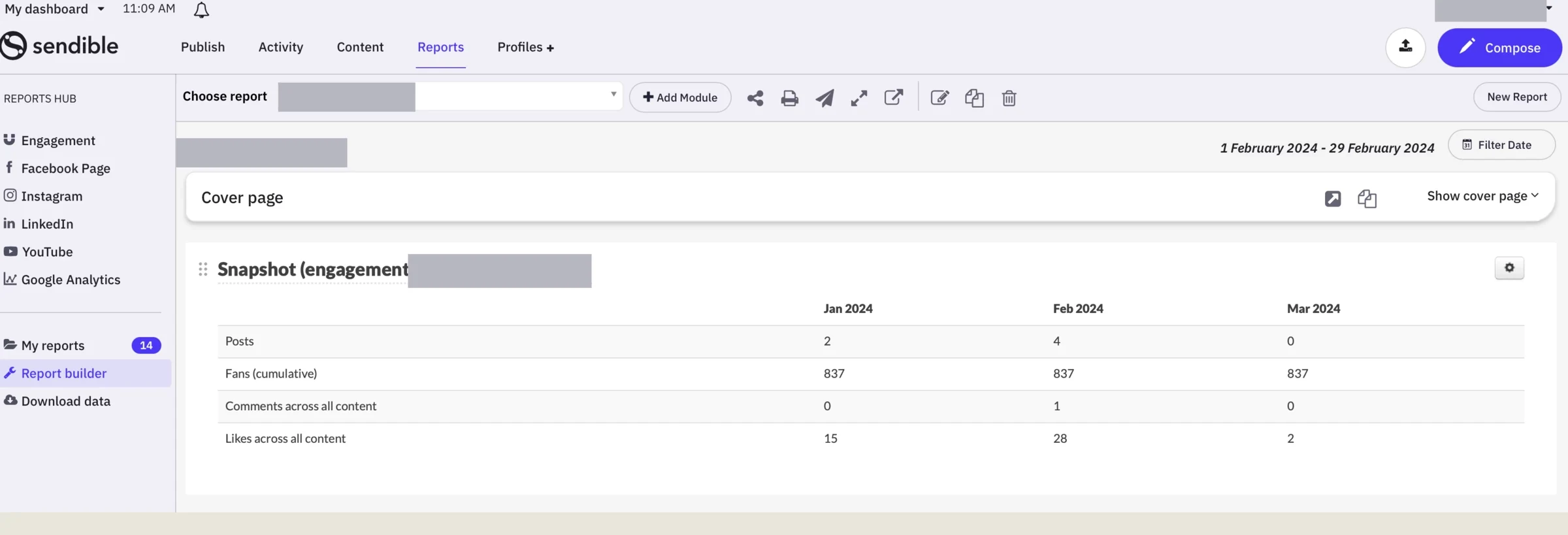
- Quick reports: fixed and network-specific. Pick Facebook, get a Facebook report, take what you’re given.
- Custom reports: flexible, but built on foundations that couldn’t take any more weight, and sat behind a higher plan.
Every new network meant building the same thing twice. A customer who picked a quick report and then wanted one different module had nowhere to go, because the two systems shared nothing.
The clearest evidence came from the one report meant to be the exception.
“Would like to check why the YouTube and TikTok are not included in the engagement report? As for now it only shows Facebook, Instagram and LinkedIn. Can we include other social media profiles inside?”
The Engagement report existed to aggregate every network a customer had connected.
TikTok and YouTube sat in the sidebar beside it, connected and reporting fine on their own, and there was no control to add them.
Not a report doing its job badly. The aggregate report failing to aggregate.
Which meant the fix was never going to be a list of bugs.
What that architecture produced
The seams showed up as small bugs that customers read as lies. A report claiming four Facebook posts when there had been many more. Engagement climbing while the arrow beside it pointed down. Exports breaking on long titles, or returning five metrics for one page and seventeen for another.
Accounting firm · NPS score 0 Reporting just isn't what is needed to manage anything at scale.
Franchise operator I had what appeared to be unreliable numbers when I looked at reporting.
Multi-location retailer It's fine for posting, but for reporting and analytics it isn't that strong a platform.
Agency, legal sector clients Despite the date filter set to Feb 1st to 29th, the widget is still showing 4th Jan to 1st Feb.
Marketing agency September saw higher engagement than August, but the percentage shows a decrease.
Agency, tourism client My client wants demographics. I don't see that as an option under Report Builder anymore.
Recruitment I'm not seeing impressions as an available metric.
Influencer marketing agency Modules always get added to the top, and dragging them to the bottom is tedious.
Nonprofit I need January to December. Engagement doesn't give me all the information.
Media monitoring, APAC Why are YouTube and TikTok not included in the engagement report? It only shows Facebook, Instagram and LinkedIn.
None of those are hard problems on their own. Together they teach someone that the number on the screen might not be true, and once that’s learned, no individual fix un-teaches it.
Discovery
I was given a brief and asked for flows. I went and talked to people instead.
Reporting landed with me in February, along with a conceptual prototype and a brief to come back with flows and hypotheses.
Over three weeks I sat down with the three functions that absorb the consequences of reporting nobody trusts.
Customer success
White-label reporting
“No comparison beyond 90 days”
Year-on-year impossible
Onboarding
New customer expectations
“High standards on how a report looks and what it contains”
Approvals cause churn
Support
Recurring friction
“No period comparison. Multi-location is painful”
Post metrics missing
Request light-agent access to the support desk
To read what customers wrote, not summaries of it
- Customer success, on white-label reporting. Surfaced that customers couldn’t compare anything beyond ninety days, a limit that quietly makes year-on-year reporting impossible.
- Onboarding, where new customers arrive with high standards on both how a report looks and what it contains.
- Support, on what comes back repeatedly: missing post-level metrics, inflexible date ranges, no period comparison, and a painful experience for anyone managing multiple locations.
Then I asked for light-agent access to the support desk, so I could read what customers actually wrote rather than a summary of it.
The requests had been accumulating for over a year, logged by six different people across support and success. The first project alone carried 29 customers and 13 project-level requests before a line was designed. I wasn’t gathering opinions. I was reading a case colleagues had already been building without anyone asking them to.
Every quote above came from those three weeks. None of it was in the brief.
What all of it pointed at was one decision nobody had questioned.
The unified model
The rebuild’s central decision was to stop treating quick reports and custom reports as different things.
The old split forced a choice at the worst possible moment: before you’d seen anything. Pick quick and you got speed with no room to move. Pick custom and you got a blank canvas and no idea where to begin. Neither matched how people actually work, which is to start from something close and adjust.
So the new system has one experience with two entry points.
Start from a template and you get a report already populated for that network. Start from scratch and you get an empty canvas. From that point they are the same thing: the same canvas, the same module library, the same editing behaviour. A template is a starting position, not a category of report.
Two separate products
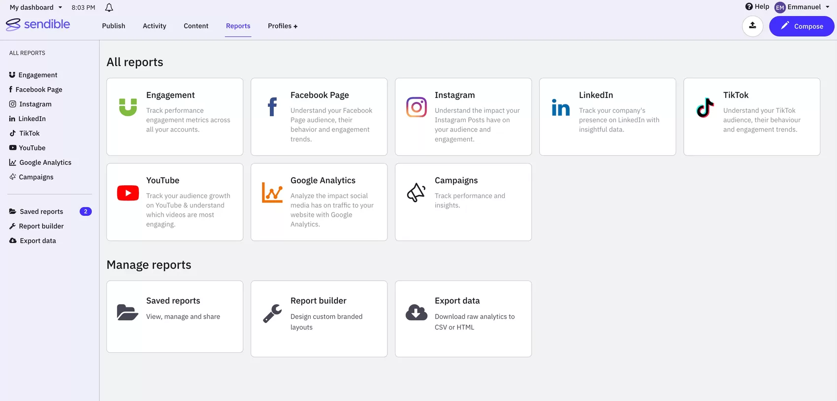
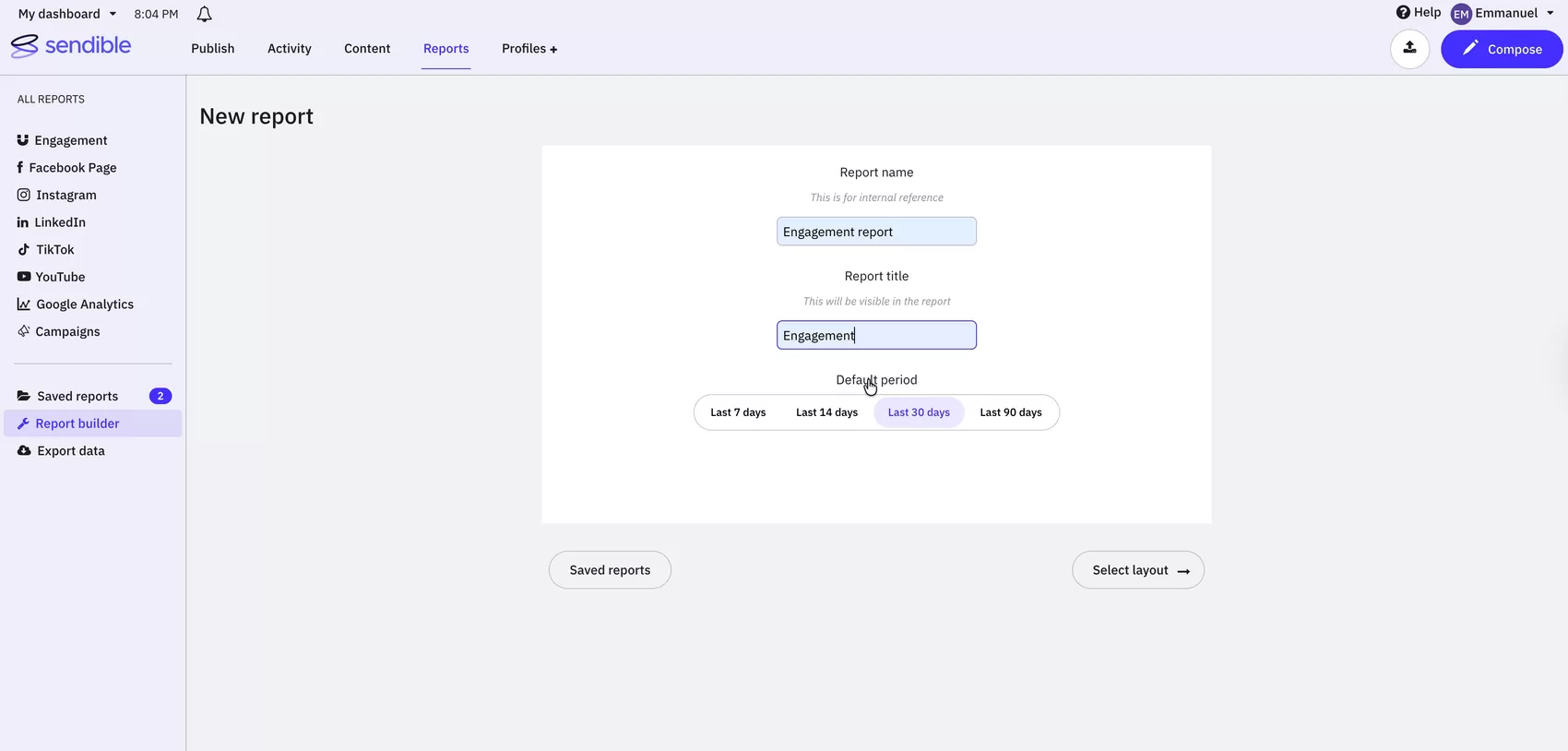
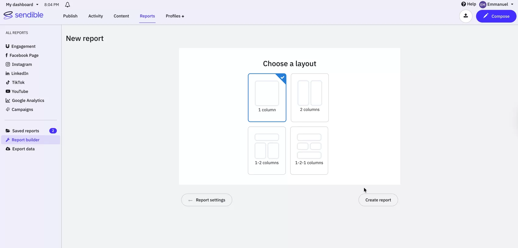
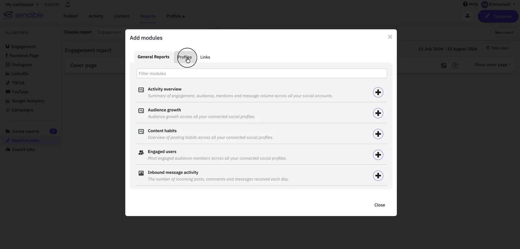
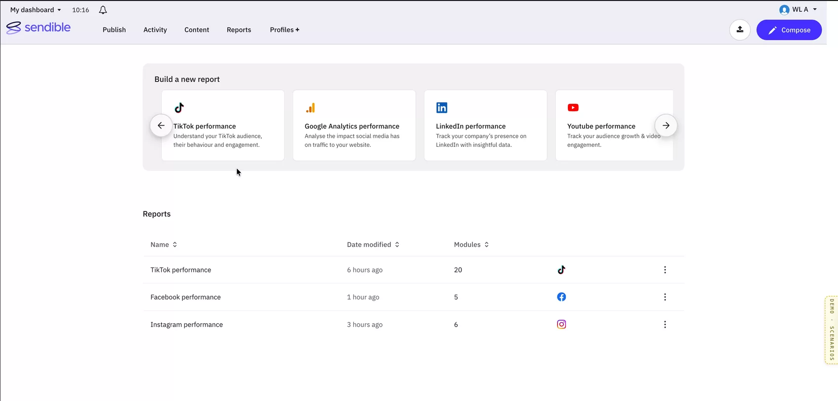
Quick reports give you one fixed tile per network.
That collapses several problems at once.
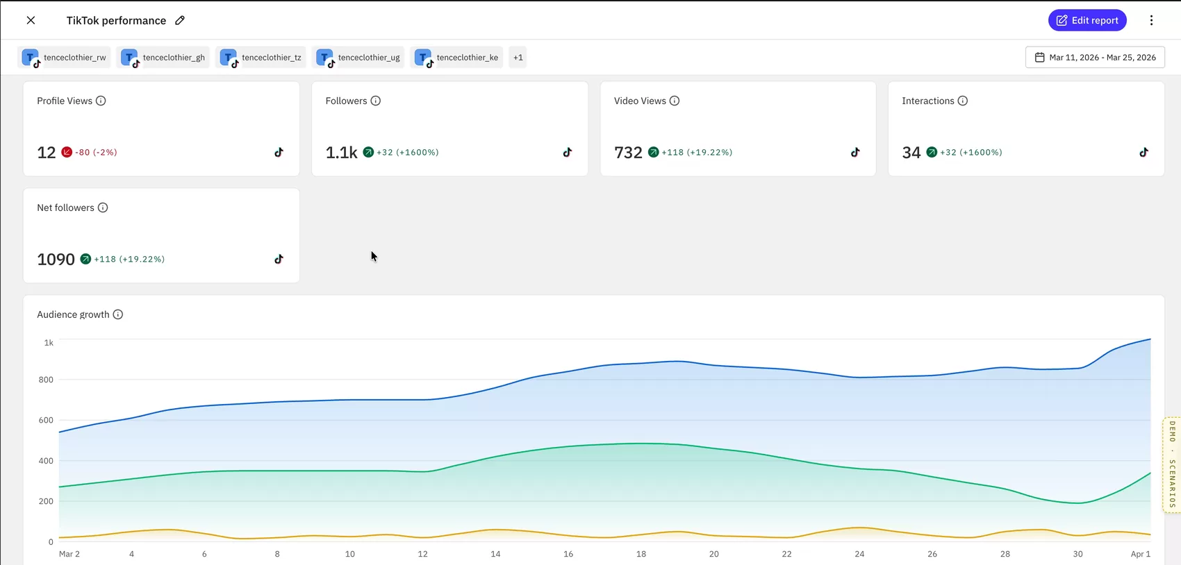
Every report is editable. Someone who picks a Facebook template can add a cross-network module, remove one that isn’t relevant, or change how a metric is visualised. Under the old system that person would have had to abandon their report and start again in a different product area.
Customisation becomes a permission, not a product. Editing and sharing switch on or off by subscription tier rather than by which system you happened to enter through.
That is what the Premium tag on the start from scratch card marks. Every template is available to everyone, on every plan. What a lower tier doesn’t get is the ability to change a report once it opens, which is the same restriction whether you began from a template or from nothing. Under the old model that limit was expressed as a whole product area you couldn’t reach. Under the new one it’s one capability, applied consistently.
New networks stop costing double. One system, one set of modules, one canvas. Adding a network becomes adding modules rather than building a parallel product.
Design principles
I specified how the system should behave before drawing any of it.
Six states a report can be in when it can’t show what the customer expects: profile disconnected, permission missing, no data for the period, no compatible profiles selected, no profiles selected, loading.
Each expresses at two levels. A tag on the profile that caused it, and a message where the customer notices the gap. Loading splits by scope for the same reason, so someone waiting on one chart doesn’t think the whole report has stalled.
What had cost us customers wasn’t an absent feature. It was a report showing something wrong and saying nothing about it.
No data for this period
Try a different date range to see results.
No compatible profiles selected
This module needs a Facebook profile. Add one to see data here.
Loading data
This can take a moment for reports with many profiles.
No profiles selected
Modules will populate once you select profiles to report on.
Loading your report
This can take a moment for reports with many profiles.
A module blank because a profile lost its connection is a different problem from one blank because nothing happened that week. Under the old system both showed nothing, and a customer who can’t tell those apart learns to distrust both.
So “No Data” had to carry a machine-readable reason: a state the interface can explain and an export can reflect. In design review I put it plainly, the error state has to say what is wrong and how to fix it. The note from that meeting recorded that I’d define the states and redefine the whole interface and interaction model.
Two rules came out of that, and they look like opposites.
Never hide capability. Name the barrier.
Nothing a customer can’t currently use gets hidden. It stays on screen and says why.
A template for a network you haven’t connected keeps its card and says Connect profile. The start from scratch card, which needs a higher tier because building a report from nothing is a customisation action, says Premium.
Hiding either would have made the product look smaller than it is and left the customer with nothing to act on. It’s the same instinct as the “No Data” reason moved one level up: don’t remove the thing, explain what stands between the person and it.
 WL A
WL A 
Build a new report
Cross-platform summary
Compare performance across connected channels
Facebook performance
Understand the impact your posts have on your overall metrics.
Recent reports
Show only what this decision needs.
The template cards briefly carried a module count, telling you how many modules you’d get. I liked it. I took it out.
The test we used was whether something served the decision in front of the user. Premium and Connect profile are barriers you need before choosing. A module count is detail you want after choosing. One belongs on the card, the other belongs on the next screen.
Both rules come from the same place. One adds information and one removes it, and what decides is whether the person needs it yet.
Templates panel
Iterations
The first version went for presence: cards running edge to edge, wider than the container they sat in, with the rest a page-arrow away. Bold, but it left half the templates off-screen.
The template panel had a problem that gets worse with time. Every network we support adds a card, and a panel can’t grow forever.
The first versions went for presence, six cards running edge to edge, wider than the container they sat in. Cutting to four fixed the layout and raised a fair objection: if your network isn’t on screen, is it supported? So I tried the opposite, put all of them on the page, and watched the panel swallow the entire first screen. Anyone returning to find a report they’d made last week now had to scroll past a wall of templates they’d already chosen from.
What shipped stops treating it as a choice. Four cards stay visible, the rest sit one control away, and every card names its own barrier. The smaller set ended up carrying more information than the larger one had.
Reports list
It began as a table with its own furniture: filter tabs, a search field, a grid-and-list toggle, and a bordered card, all built for this one page.
The list shipped smaller than it started, by reusing something that already existed.
It began as a table with its own furniture: filter tabs, a search field, a grid and list toggle. All of it built for this page.
What shipped threw all three away and used the filter component that already existed elsewhere in the product. Sortable columns. Network icons in a column of their own, so you can see what platforms a report covers before you read its name.
Reusing a component someone else had already built was the better design decision and also the cheaper one.
Edit mode
A line of text in the header naming the current mode, with an Edit link beside it. Follow the cue: Edit → Save → Exit.
Telling someone whether they’re viewing a report or editing it took nine iterations, and the answer wasn’t a bigger notice.
Every one was a different arrangement of the same idea: a sentence naming the mode. Inline in the header, then a full-width banner, short then long then short again. I kept adjusting the words, their placement, their weight.
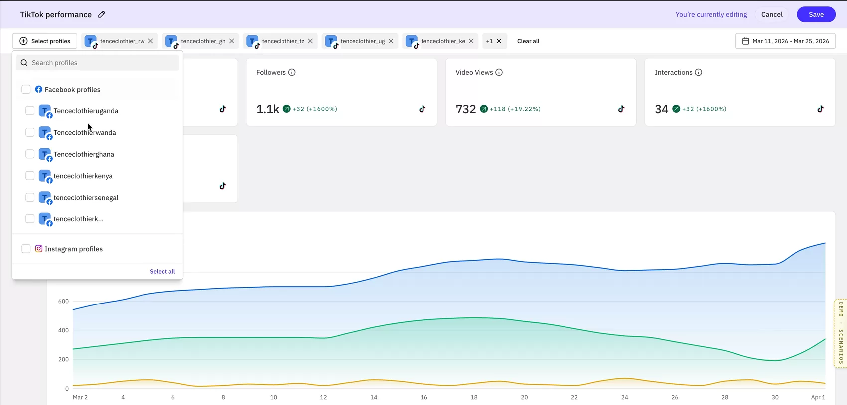
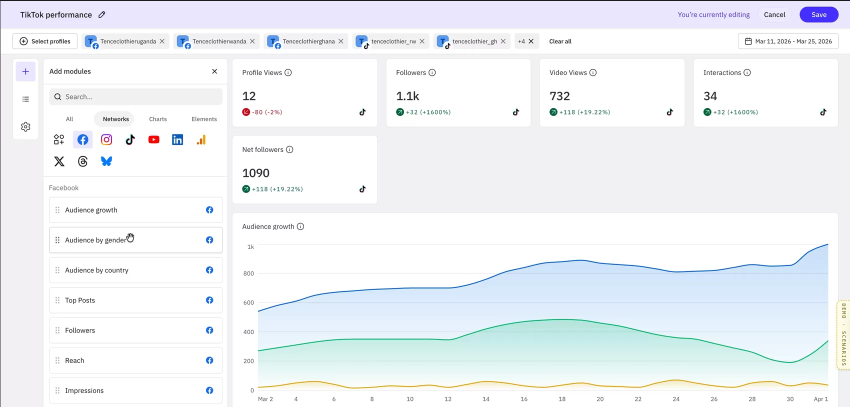
What shipped mostly stops explaining. View mode carries no notice at all, just an “Edit report” button, the way in is the whole message. Enter edit and the header fills with colour, with a quiet “You’re currently editing” beside Cancel and Save.
Three of those takes are above; the last one shipped. In view mode, a notice was the wrong instrument, I’d spent nine iterations refining an answer instead of questioning the question.






There’s a second decision inside that one. View mode isn’t a separate screen, it’s the same screen with about a dozen elements switched off. The rail, the module panel, the action buttons. Same objects, different visibility.
That’s what stops two modes drifting apart during build, and it’s what made the cut-down version possible later.
The prototype
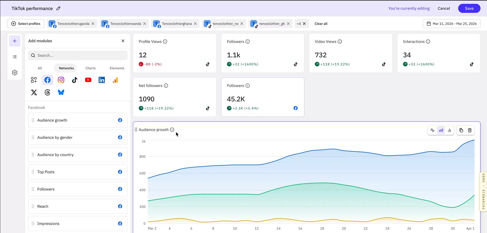
I built a working prototype in code rather than a clickable file: a report hub with templates, the reports list, the module library and a live canvas.
It did two jobs, for two different audiences.
For the team, it made behaviour testable. Grid behaviour, module resizing and drag-and-drop are things you can’t evaluate by looking. You have to move something and watch what happens to everything else. Questions that would have taken a meeting to resolve got settled by someone dragging a module and seeing where it landed.
For everyone else, it made the project visible. Until then Reporting 2.0 existed as documents: a requirements spec, a state model, meeting notes, a Linear board. People outside the working group knew a rebuild was happening and had no way to picture it. A rebuild you can open in a browser is a rebuild people can form an opinion about, ask questions about, and argue for.
Support could see what they’d eventually be answering questions on. Customer success could see what they’d be able to promise. It turned an abstract roadmap item into something with a shape.
The product decisions, the state model, the interaction design and the interface were mine. Claude Code was a fast pair of hands that let me put something in front of people instead of describing it to them.
Working alongside frontend and backend we settled architecture as we went. Social icons served from the design system rather than stored in the backend. Date ranges saved as rolling periods rather than fixed dates, so a report shared in March doesn’t quietly become wrong in April. Profile IDs stored per report.
Facebook and TikTok were built. Nineteen TikTok modules reached the front end in early July, and the work moved into internal testing.
Scoping to two networks
The design assumed nine networks. The first release supported two.
The easy version ships the nine-network layout with seven cards missing. Instead:
- Re-proportioned the row so three cards fill it completely
- Removed the expand control, which would have promised templates nobody could reach
- Brought start from scratch back into the card set, reversing my own earlier decision, because it was right for a page with nine options and wrong for one with two
Why it mattered
There’s no launch metric on this one. Instead there’s a precise picture of what reporting was costing, drawn from the same sources the design came from.
Retention. Reporting was named in NPS detractor responses, in a churn survey, and by an account now formally evaluating replacements for 2027. These weren’t customers who disliked the product, two of them said the opposite in the same breath. Reporting was the single thing pulling them out.
Expansion. One customer bought a larger package specifically to get custom reporting, didn’t get what she needed, and went to Meta’s free dashboard instead. Reporting was already an upgrade trigger; it just wasn’t holding the customers it attracted.
Plan choice. A trialist with fifteen years of experience chose a smaller plan because she didn’t trust the numbers she saw. Reporting was affecting purchase decisions before anyone had spoken to sales.
Support load. The recurring ticket categories were all reporting: export formatting, metric inconsistency, date filters, retention limits, profile caps. Each is a system problem handled one conversation at a time.
Pricing. The business intended to position the new reporting as a value-added feature supporting a price increase. That only works if the thing is trusted.
So the target wasn’t a conversion rate. It was the moment a customer opens a report, sees a number they weren’t expecting, and has to decide whether to believe it. Everything in the state model exists to make that moment recoverable, to give the interface something honest to say when it can’t say what the customer hoped.
Where it stands
The project was paused in July, and the designs still stand as the intended replacement.
The company changed how projects get approved: every initiative now needs a cost-benefit case, a one-month delivery window, and a path to being sold as an add-on. A six-month rebuild doesn’t fit that shape, and Reporting 2.0 was paused with Facebook and TikTok built and in internal testing.
The same decision recorded that legacy reports will still be replaced with these designs, positioned as the value-added feature. The timeline changed. The plan didn’t.
What I’d carry forward: the state model. Modules will change, networks will come and go, someone will redraw the layout eventually. What a report should say when it has nothing to say won’t change, and it’s the question that started this.