
UX Designer · LawPavilion · 2020–2021 · 8 min read
When search is the whole product
Rebuilding Nigeria's legal research platform for lawyers preparing cases they might lose.
- 75%
- of every issue raised was about search, in a survey of 50 practitioners
- 12,000+
- daily active users, up from 6,486 (company figure)
- +40%
- profit within eight months of launch (company figure)
What I did
One of three designers on a full rebuild, where the research found that search was not a feature of the product but the whole of it.
- Worked alongside a product manager, three engineers, two in-house lawyers and QA
- Ran interviews and focus groups, then a survey of 50 practitioners analysed statistically to cluster users into groups that behaved similarly
- Turned raw findings into themes with empathy and affinity mapping and a lean UX canvas, then scored every idea on impact against effort
- Found search was the feature users named as most valuable and the subject of 75% of all issues raised, and that 40% called the old product unreliable
- Defined the product’s information architecture with the two other designers, then wireframed and tested every major flow before any visual design
- Designed the features that came directly out of that research: search without limits, multiple reader tabs and judgment analysis, plus Counsel Pro, the high-effort bet
- LawPavilion reported 85% growth in daily active users and a 40% profit increase within eight months of launch
The product
For most Nigerian practitioners, Primsol is not a convenience layer over public data. It is the access.
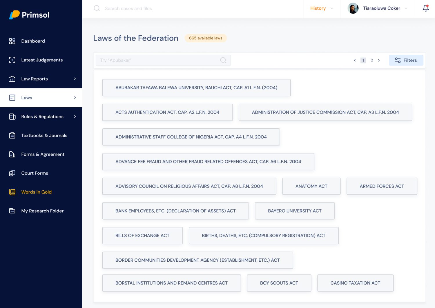
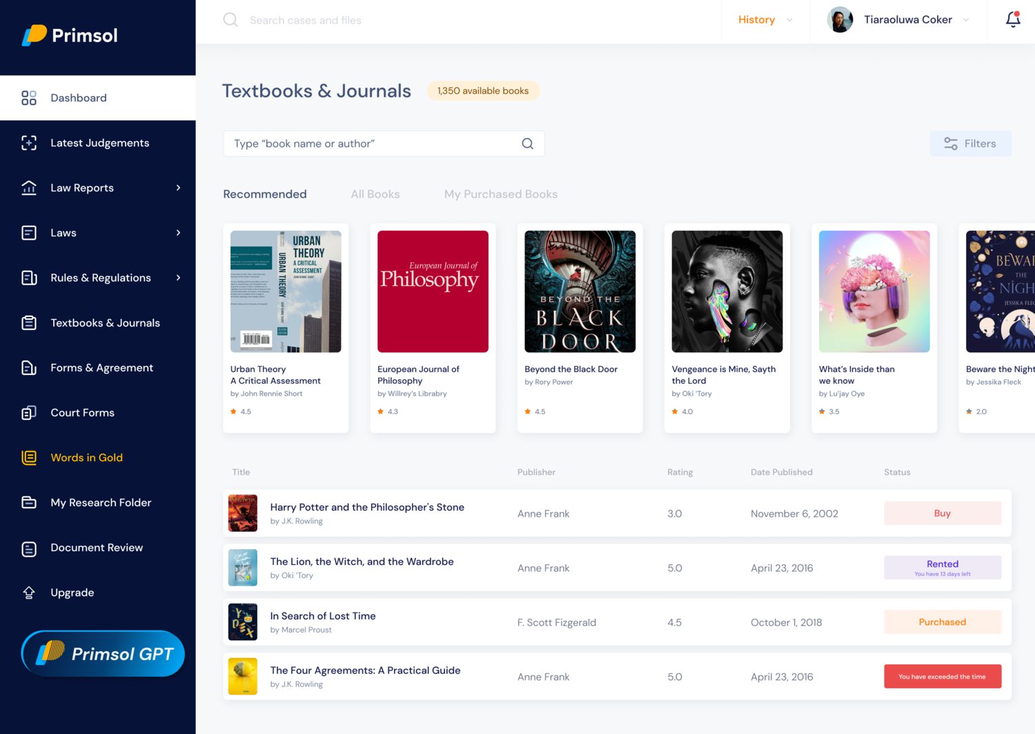
Nigerian case law isn’t comprehensively available anywhere else, so the platform carries the working record rather than a searchable copy of one held somewhere more authoritative: 43,288 law reports, 12,500 rules and regulations, 685 federal laws, 1,350 state laws, plus textbooks, journals and court forms.
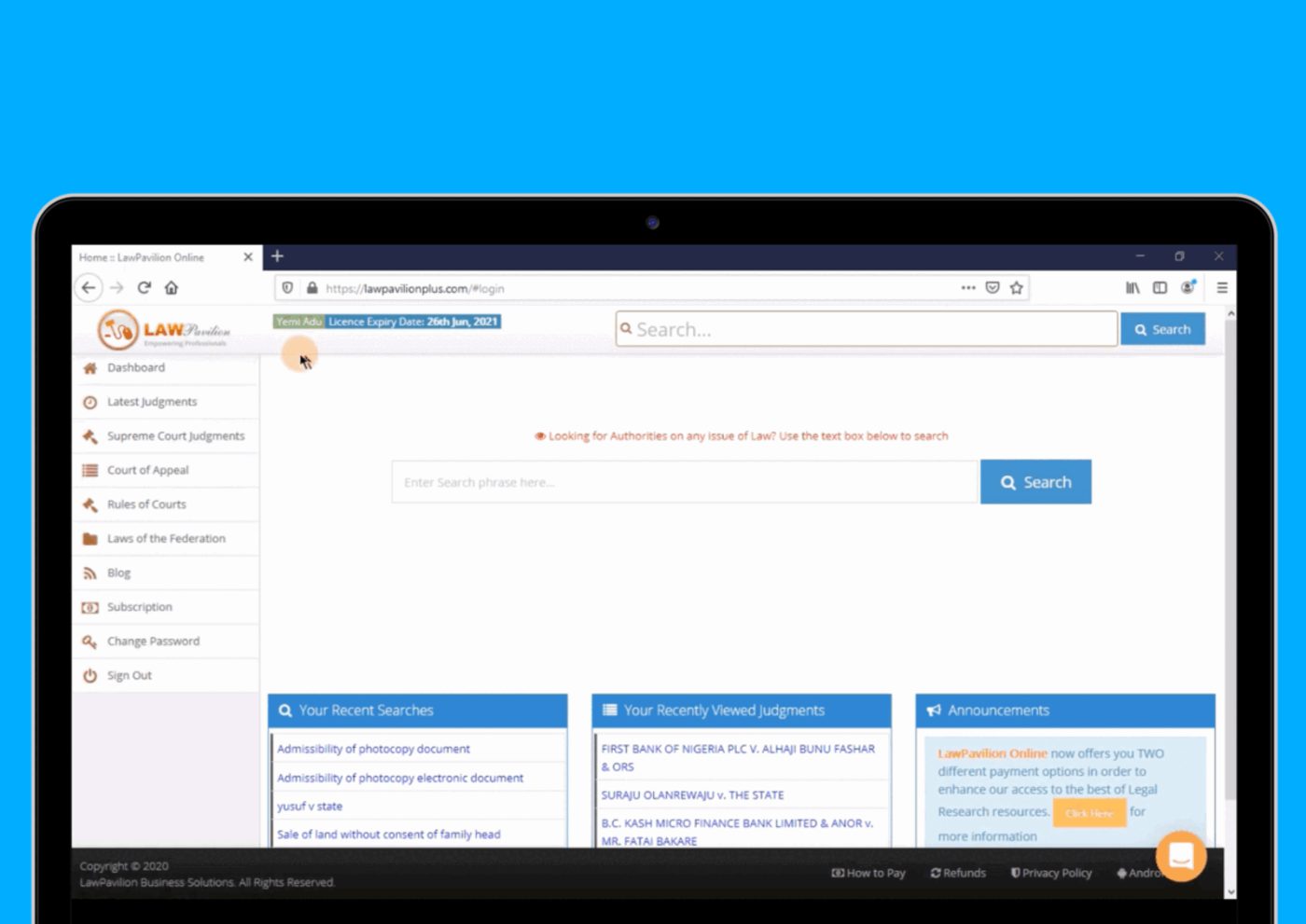
By 2020 it had been running long enough to have accumulated everything products accumulate, and it was starting to lose the new users it was winning.
The problems
Nothing was designed until the whole team had been through the product against a benchmark. Designers, engineers, product management, product marketing, customer success and the two in-house lawyers, all reviewing the same thing before anyone proposed a fix. Four problems came out of it.
Workflows had grown without structure. Years of additions had produced what we described at the time as a kitchen sink of complex controls, with copy written in language that assumed you already knew the system.
Drop-off was worst at setup. Very high, which pointed at onboarding and at complexity people met before they’d got any value.
It couldn’t take another feature. The architecture hadn’t anticipated growth, so every addition made the next one harder.
And the content was being scraped. People were pulling material off the platform for their own use, which mattered commercially, and constrained what we could design, because the obvious fix for discoverability is to open more of it up.
That last one set the hardest constraint in the project: the thing most likely to win new users was also the thing most exposed to abuse.
Running underneath all four was a business decision taken at the same review, to position Primsol for enterprise rather than individual practitioners. It shaped what counted as a good idea for the rest of the project.
How we worked
Three designers, and a research programme rather than a brief.

We ran interviews and focus groups with practising lawyers, then took the themes from that into a survey we could analyse statistically, clustering respondents into groups that behaved similarly, rather than treating “lawyers” as one audience. A partner at a commercial firm, a lecturer and a final-year student use the same product for genuinely different reasons.
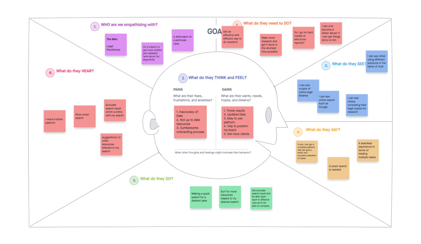
Then an empathy mapping workshop and affinity mapping to get from raw findings to themes the whole team could argue with.
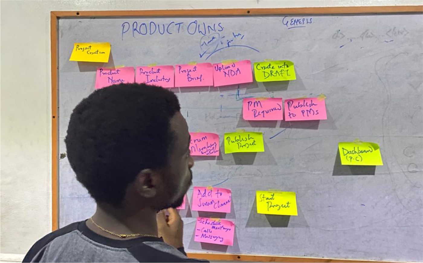
Ideation ran across the whole team, not just design. That was deliberate, the people who’d been supporting this product for years knew things about it that no amount of research would surface in six weeks, and the in-house lawyers were users as well as colleagues.
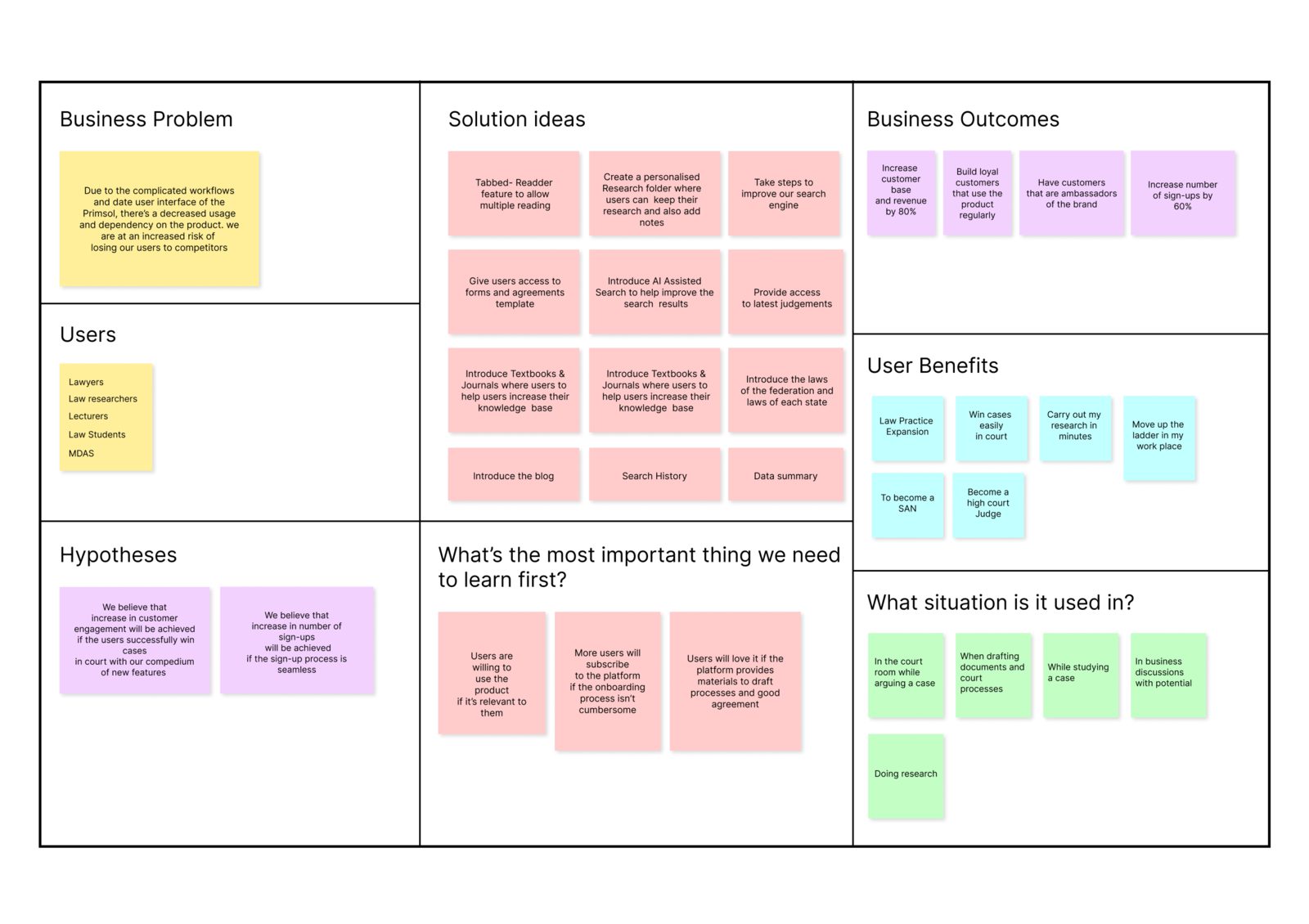
We filled a lean UX canvas, business problem, business outcomes, users and their desired outcomes, solution ideas, hypotheses, then scored everything on impact against effort.
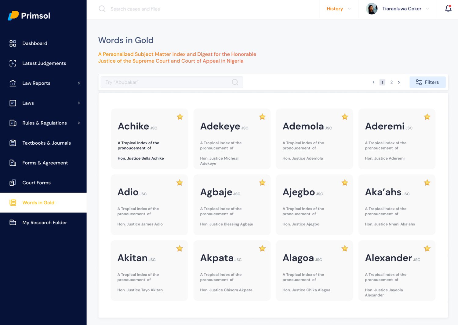
We shipped everything in the high-impact, low-effort quadrant, took one bet from the high-effort one, and deferred the rest. Search, law reports, latest judgments, words in gold, textbooks and journals, forms and agreements and practice notes all sat in the high-impact, low-effort quadrant, and all of them shipped. Counsel profiling, document similarity, AI-assisted search and AI document review sat in high-impact, high-effort. We shipped counsel profiling and deferred the other three.
That was the call worth arguing about. In 2020, with the team we had, taking all four would have consumed the release and delivered none of the fundamentals. Counsel profiling earned its effort because it answered a question the research had already surfaced. The other three were bets on capability rather than on a known need.
Findings
The feature users named as most valuable was the same one generating three quarters of the complaints.
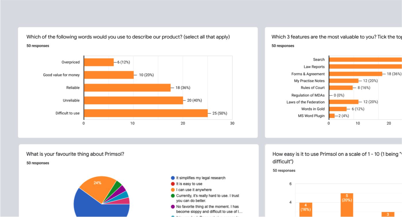
Fifty practitioners answered the survey. Asked to pick their three most valuable features, they put search first. Asked what was wrong with the product, 75% of everything they raised was about search.
Half described the product as difficult to use. Not slow, not missing features. Difficult.
And 40% described it as unreliable, against 36% who called it reliable. In a tool people use to check whether a judgment still stands, users splitting on whether it can be trusted is the more serious of the two findings, and it set the emphasis for everything in judgment analysis.
Everything in the next two sections came out of those answers.
Structure
Before any of it was designed, it had to be organised.
The three of us defined how content would be structured and surfaced across the product, then took the architecture to the team and stakeholders for review. This was the part the old product had never had. A kitchen sink of controls is what happens when features are added to a structure that was never built to receive them, so redrawing the structure was the actual fix for the second and third problems.
We wireframed every major flow and tested immediately, with the in-house practitioners and a selection of real users, before any visual design existed. Testing at wireframe stage is why the search work held up. We could confirm people could find it and use it while it was still cheap to move.
What we built
Three features answered specific research findings. A fourth was the bet we chose to take.
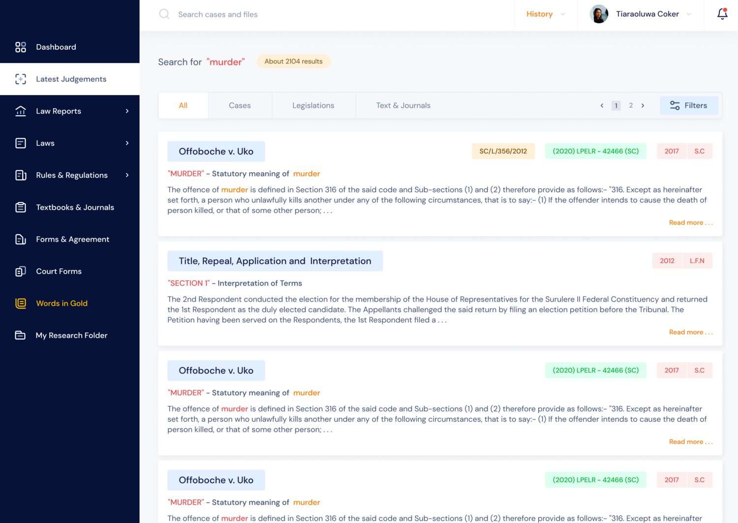
Search without limits. Filtering across judgments by subject matter, principle and issue, and usable without a subscription. That last part was contentious given the scraping problem, and it was the right call: a research tool that won’t let you search until you’ve paid can’t demonstrate that it’s worth paying for.
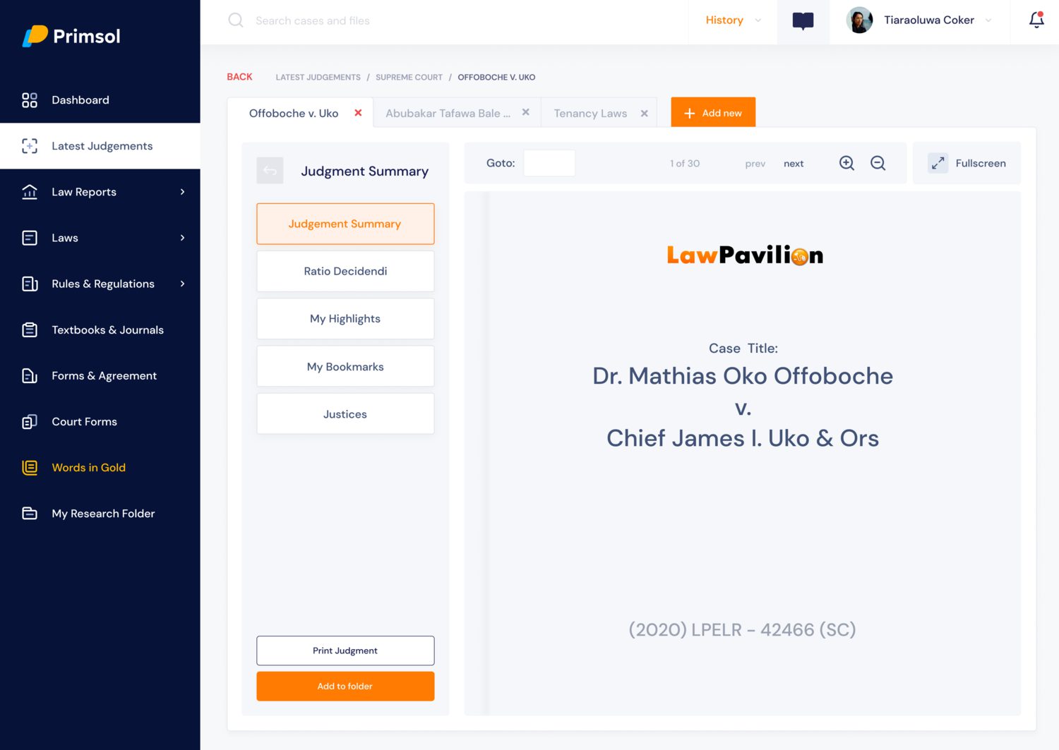
Multiple reader tabs. The finding underneath this one is simple and nobody had designed for it. Legal research isn’t reading a document, it’s checking one authority against another, then a third, then going back to the first. Practitioners were doing this across browser windows and losing their place constantly. Tabs inside a single research view matched what they were already doing.
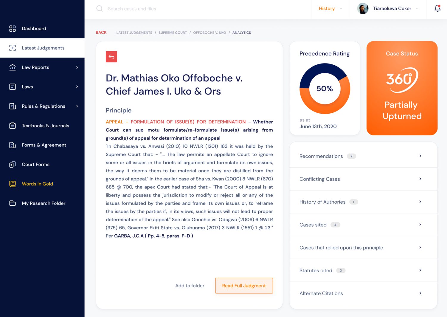
Judgment analysis. Case status, precedence rating, related cases, conflicting cases, history of authorities and citations, presented together. A lawyer needs to know not just what a judgment said but whether it still stands, and that’s exactly the kind of thing that’s catastrophic to get wrong and easy to miss. It is also the direct answer to the 40% who called the old product unreliable, because the fix for a trust problem is showing your working rather than asserting accuracy.
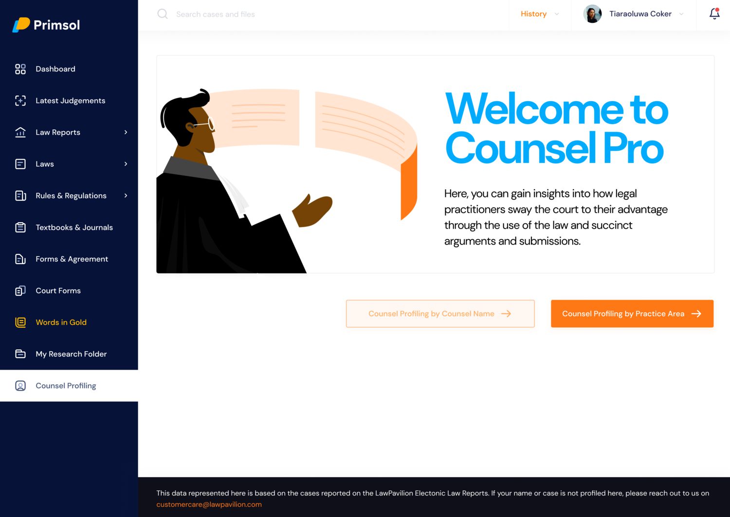
Counsel Pro, the high-effort bet. Profiling how practitioners argue, searchable by counsel name or by practice area, so a lawyer can see how a matter has been won before. It shipped with a line on the screen stating that the data covers only cases reported in LawPavilion’s own law reports, which mattered: a profiling tool that overstates its coverage is worse than no profiling tool.
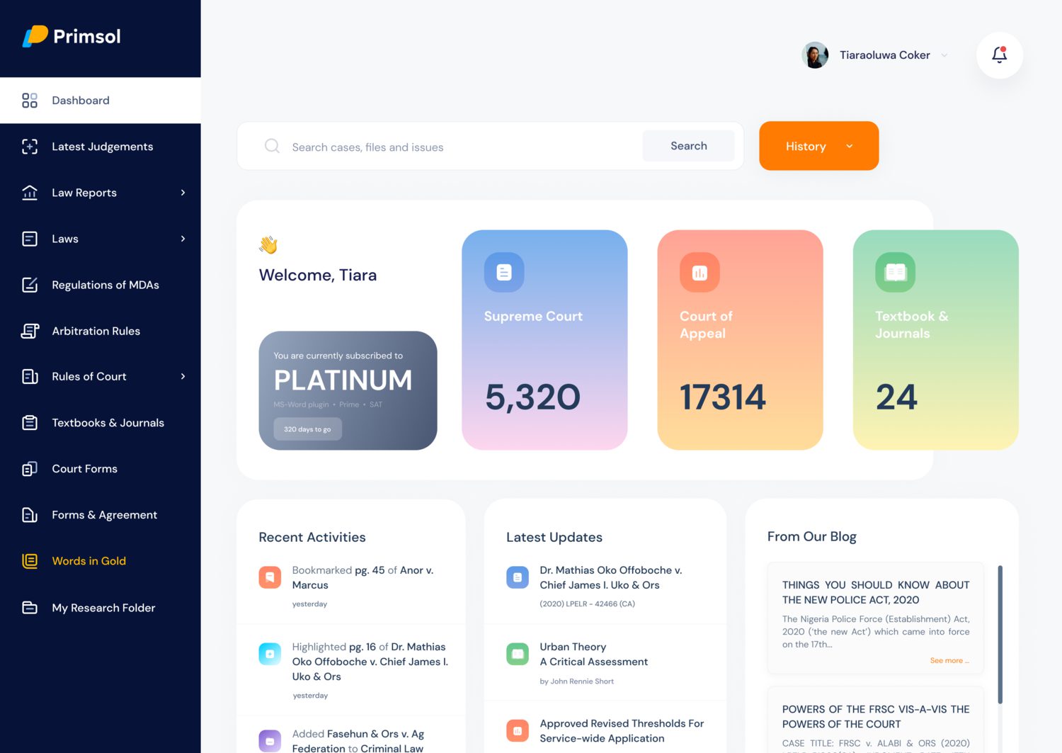
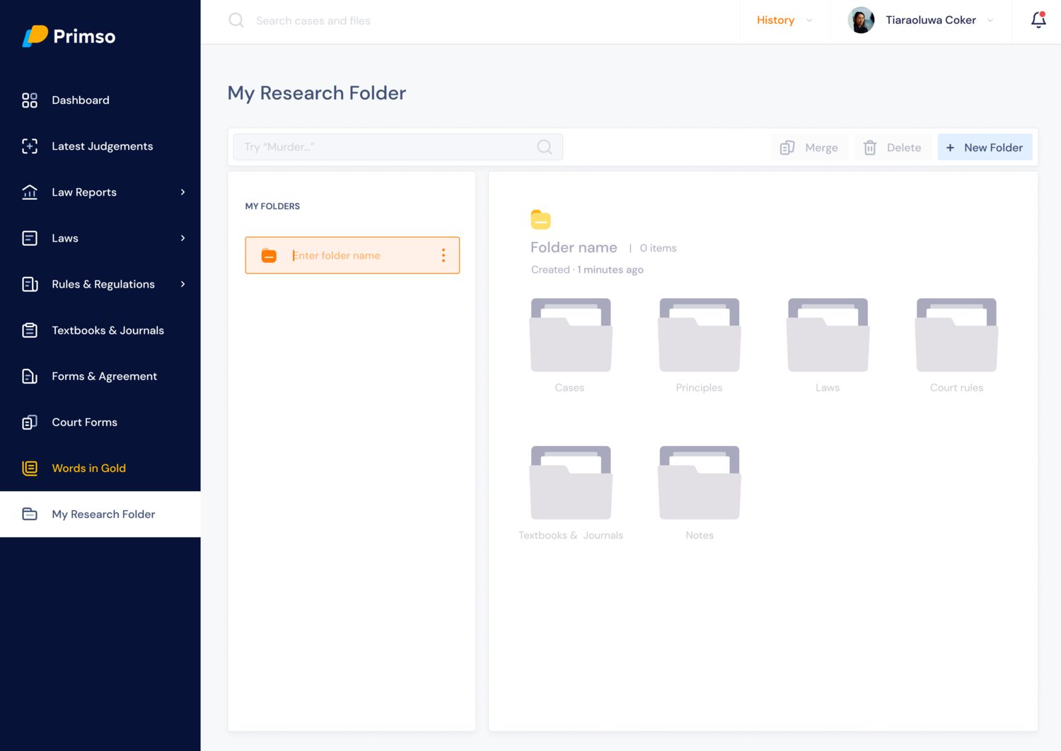
The dashboard surfaced likely-relevant cases from previous searches, the smaller idea I’d still defend.
Results
LawPavilion reported an 85% increase in daily active users over the following year, from 6,486 to over 12,000, and a 40% increase in profit within eight months of launch.
Those are the company’s figures rather than measurements I took, and this was a three-designer team inside a much larger project. I’m not claiming the outcome as mine.
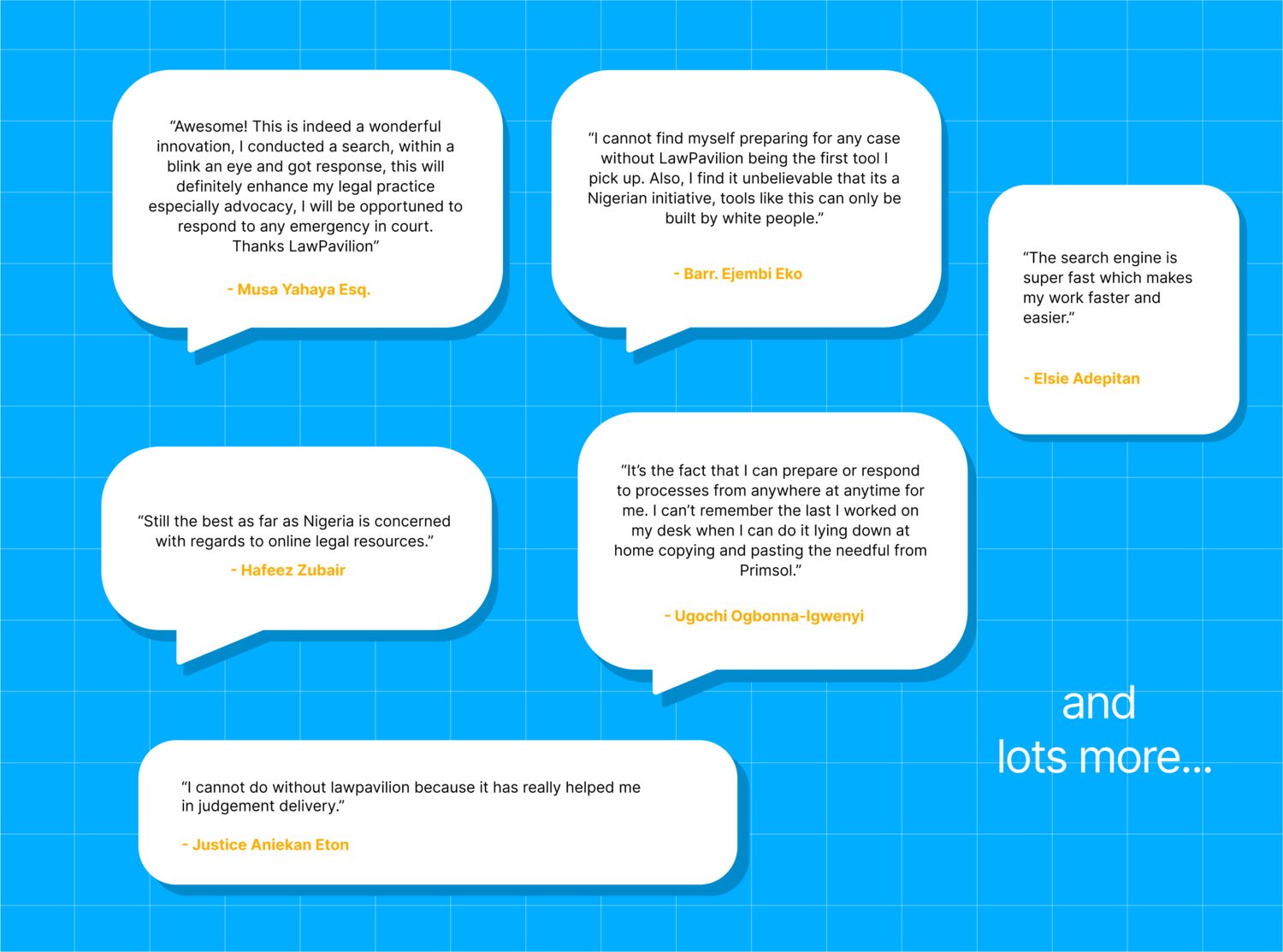
What I can speak to directly is the user feedback that came back afterwards, because it named something specific: the multiple reader tabs were what made people stay longer in a session. The feature that came out of watching how lawyers actually cross-reference turned out to be the one that changed behaviour.
What I took from it
I’ve never worked on anything since where being wrong mattered as much. If a social media scheduling tool shows you a number that’s slightly off, you make a slightly worse decision. If a legal research tool tells you a judgment stands when it’s been overturned, someone loses a case.
That’s where the emphasis on status, precedence and conflicting authorities came from, and where the coverage note on Counsel Pro came from too. It’s the same instinct I brought years later to designing what a report should say when it can’t say anything reliable. A tool that admits what it doesn’t know is more useful than one that appears confident.
The other thing was working as one of three designers rather than as the design function. Most of my work since has been the latter, and it’s made me better at moving quickly and worse at the thing this project taught me: that a structure three people have argued about is stronger than one person’s structure, and slower to arrive at for good reason.