
Design lead · Sendible · 2025 · 7 min read
A refresh is ten percent drawing and ninety percent finding
Leading Sendible's visual refresh, and the 500-asset audit nobody puts in a portfolio.
- 500+
- brand assets audited
- 34
- workstreams across eight teams
- 4
- third-party platforms it escaped to
What I did
- Led the identity refresh: the mark, the system, the tone of voice
- Audited every place the old brand lived, 56 website pages, 45 logo instances, 83 graphic images, 23 calls to action, 229 blog images, 103 landing pages
- Found the mark was hardcoded almost everywhere rather than referenced, and had escaped onto four third-party platforms
- Coordinated 34 workstreams across eight teams, none of which I managed
- Redesigned the About page so the mark reads as a graphic system, with an italic emphasis on one word per heading and the R.E.A.L tone of voice framework in its own section
- Built the public brand hub, and rebuilt its specimen sections as actual colour and actual text so a designer can copy the hex value and the type resizes on a phone
- Launched 22 May 2025, everywhere at once: announcement blog, launch video, homepage takeover, updated ad creative and merch
- Extended the identity into motion, including launch animation and micro-interactions across the marketing site, so the visual language held in movement as well as in static layout
The brief
The company was clear about what this wasn’t. From the announcement:
“We didn’t set out to change who we are. We set out to show it more clearly.”
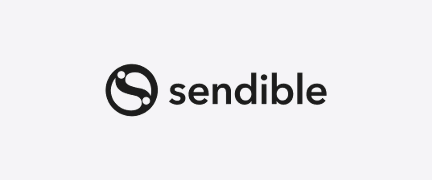
Sendible had been running since 2009 and had grown from a publishing tool into a platform used by agencies and multi-location brands. The identity hadn’t kept up, not wrong, just older than the company had become. The framing we landed on was refinement rather than reinvention: same mission, sharper expression.
That framing did real work later. It set the bar for every decision, does this make us clearer, or just different?
The mark
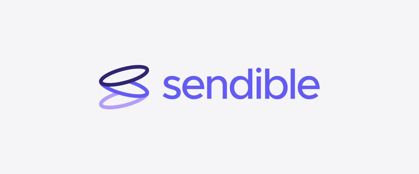
The concept came from what the product actually does. Not scheduling, not publishing, amplification. Someone with something to say, reaching further than they could alone.
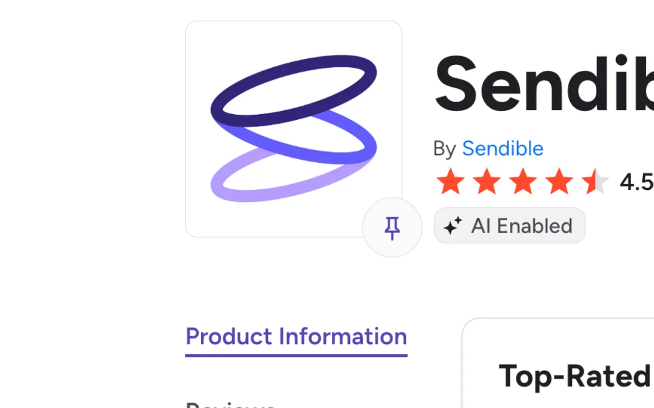
Loops. A voice echoing outwards, each loop representing growth, reach and genuine connection. Layered, because amplification compounds.
I said it this way when we launched, and I’d still stand by it:
“We explored a lot of ideas. But it was the concept of a voice growing stronger, echoing outwards, that really resonated. Our logo is made of loops, each one representing growth, reach, and genuine connection. That’s what Sendible enables.”
The identity extended past the mark into colour, type and tone of voice, the last of which mattered more than usual, because a social media tool that sounds corporate is arguing against itself.
The audit
Here’s the part that took the longest and appears in nobody’s portfolio.
A new mark is worthless until the old one is gone. So before anything shipped, I audited every place Sendible’s identity lived:
| Surface | Rows checked |
|---|---|
| Website pages | 56 |
| Logos in modules, templates and themes | 45 |
| Graphic images | 83 |
| Calls to action | 23 |
| Blog featured images | 229 |
| Landing pages | 103 |
Each entry recorded the asset type, file name, where it lived, theme, module, CSS file, page content or email template, its format, dimensions, file size, and whether it was hardcoded or editable.
Findings
Two things made this harder than swapping a file.
The logo was hardcoded almost everywhere. The obvious assumption is that a CMS holds your logo in brand settings and every module references it, change once, changes everywhere. It didn’t. The mark was baked directly into the header modules, the no-nav header, the sign-up iframe, the 2018 theme’s header and footer, four landing-page header partials, and every email template.
There was no switch. There was a list, and the list had to be made before anyone could start.
And the brand had escaped the website. The ideas portal, the help centre, the referral platform, the webinar system, four separate products, none of them ours, each holding our logo. Plus an email signature template for every person on the team, each carrying the old mark in an image.
That’s the finding I’d want a hiring manager to take from this. The interesting part of a brand refresh isn’t the mark. It’s that an identity leaks into every system a company touches, and nobody has a list until someone makes one.
Rollout
Rolling it out meant coordinating work I didn’t own, across teams I didn’t manage.
Thirty-four tracked items across eight categories, website, product, marketing assets, sales materials, customer support, internal and HR, partners and affiliates, and brand infrastructure. Each with a priority, an owner and a deadline.
Marketing had the website and email templates. Product had the app UI, logo, headers, dashboard, favicon, the white-label loading spinner, transactional emails, invoices, the Chrome extension. Social had profile images and banners. Support had the Zendesk centre, template replies and help guides. HR had internal documentation and onboarding. Partnerships had affiliate assets.
The product side deserves its own mention. A marketing refresh that stops at the website leaves customers logging into yesterday’s brand every morning. Our product designer was brought in specifically so website and product would match, and product audited its own surfaces, dashboard, authentication and password reset flows, favicon, receipts, three email types, the loading spinner, third-party integration screens.
About page
The About page is where you meet the identity, not just look it up, and it’s the page that had to prove the claim rather than repeat it. It’s still live, so rather than rebuild it in screenshots, here’s the page itself:
The mark became a graphic system
The loops didn’t stay in the logo. Blurred vector forms derived from the mark sit behind the hero, and the loop asset reappears as a section device further down. Someone scrolling the page absorbs the identity’s shape several times without ever looking at the logo.
That’s the difference between a mark and a system. A mark identifies you. A system means a page still looks like you with the logo cropped out.
One typographic device, used consistently
Amplify your voice. Be remarkable. · Why people stick with us. · Meet the team behind Sendible.
An italic emphasis on a single word per heading, always on the word carrying the meaning. Small, cheap, and it gives the writing a voice on a page where every competitor sounds the same.
R.E.A.L
The tone of voice framework, Reliable, Empowering, Authentic, Leading, given its own section rather than buried in a document nobody outside marketing reads. Values on an About page are usually decoration. Making them an acronym people can actually recall is what turns them into something a team uses in a meeting.
Brand hub
We built a public brand hub, logos, colours, typography, tone of voice, templates and downloads. It’s still live:
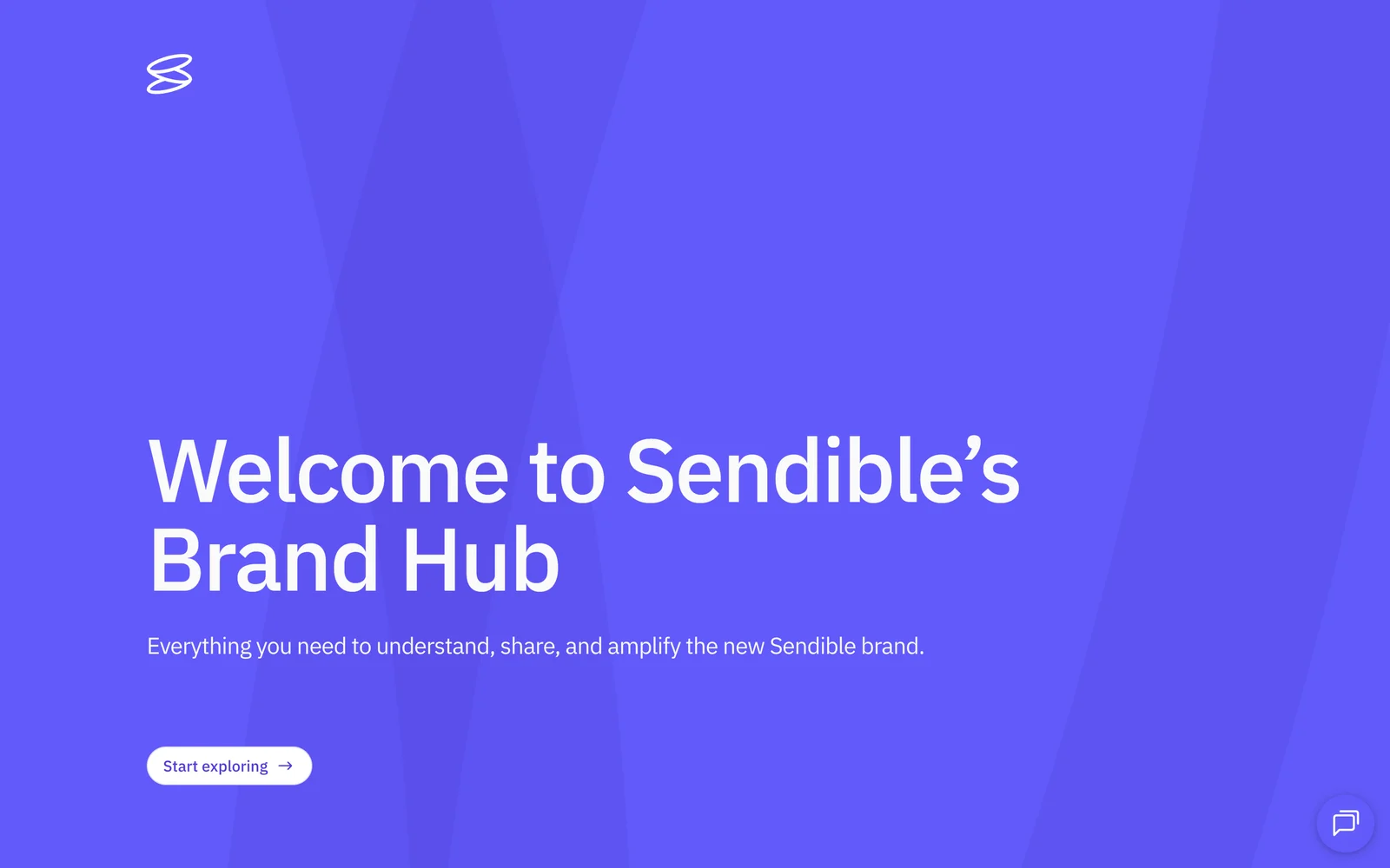
One decision on that site is worth pulling out, because it’s small and it’s the kind of thing that separates a page that looks right from one that works.
I pushed to rebuild the specimen sections as actual colour and actual text. They had been built as images, colour blocks, typographic specimens, headings.
Two reasons. A designer visiting a brand hub wants to copy the hex value, and you can’t copy an image. And text baked into an image can’t resize, so on a phone the type either shrank past legibility or overflowed.
The rest of that review was ordinary craft work, animation timing tightened from 200ms to 100ms, hover states on the primary CTA, corner radius behaviour, logos being squashed by a container, excessive padding between the logo pack and media kit sections on mobile, and a navigation fix so someone arriving at the typography section from colour didn’t skip past the main typography content.
Launch
Launched 22 May 2025, everywhere at once. An announcement blog with quotes from the Chairman, the CEO and me. A launch video showing the evolution of the mark. A homepage takeover with a before-and-after slider and a brand timeline. Updated ad creative across every channel. Digital merch, wallpapers, Zoom backgrounds, Canva templates. A hashtag campaign. Physical merch for reviewers and partners.
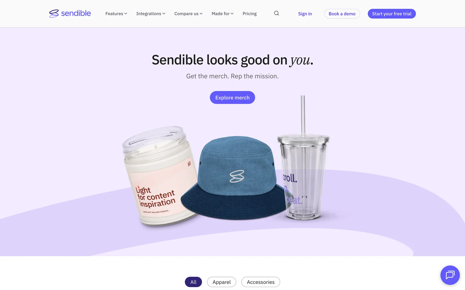
The public write-up is still up, and so is the brand hub. This browse page is the public preview of the merch; the page where people actually request it sits behind a password.
What I take from it
I’ve spent most of my career on product and growth work, and this is the project that most changed how I think about both.
A brand isn’t the mark. It’s every surface a customer touches, most of which no single team owns and none of which appears on a design file. The audit taught me to ask a question I now ask everywhere: where else does this live? It’s the same question behind designing report states rather than report screens, and behind treating view mode as a visibility state rather than a separate page. Find every instance before you change one.
The other thing is smaller. This project only worked because eight teams did work I couldn’t do and didn’t manage. My contribution to that wasn’t design, it was making a list clear enough that people could act on it without me in the room.